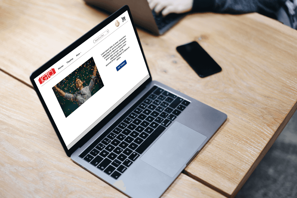
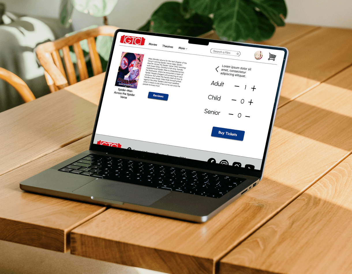
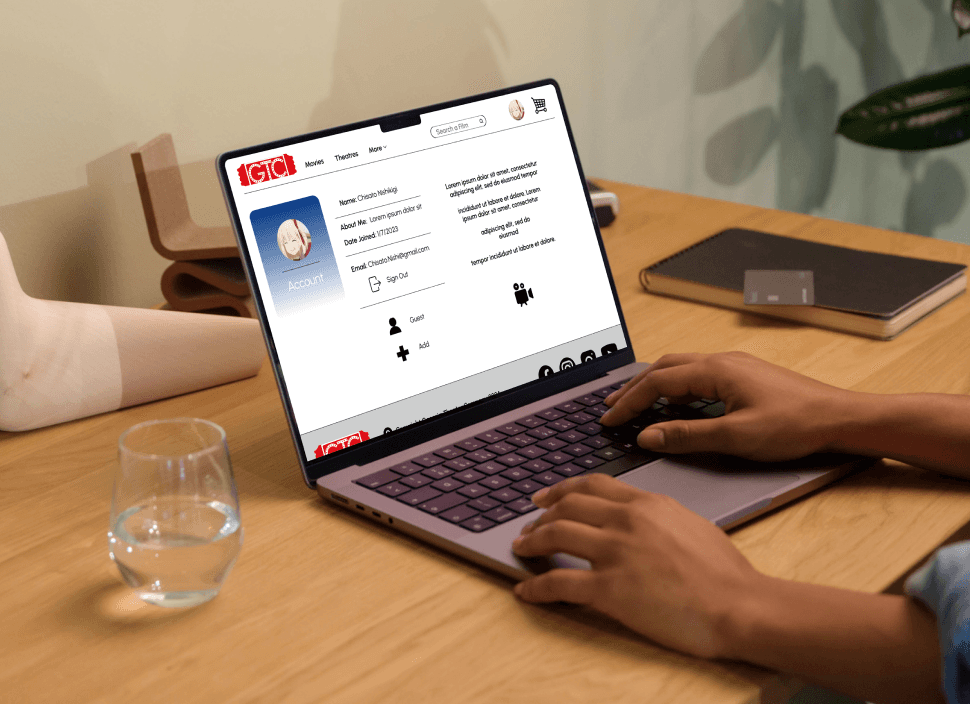
Project Vision


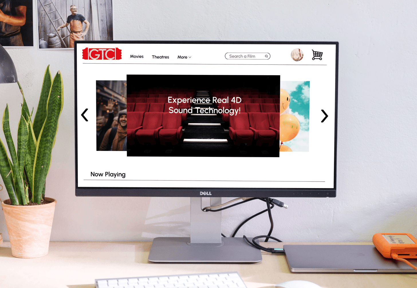
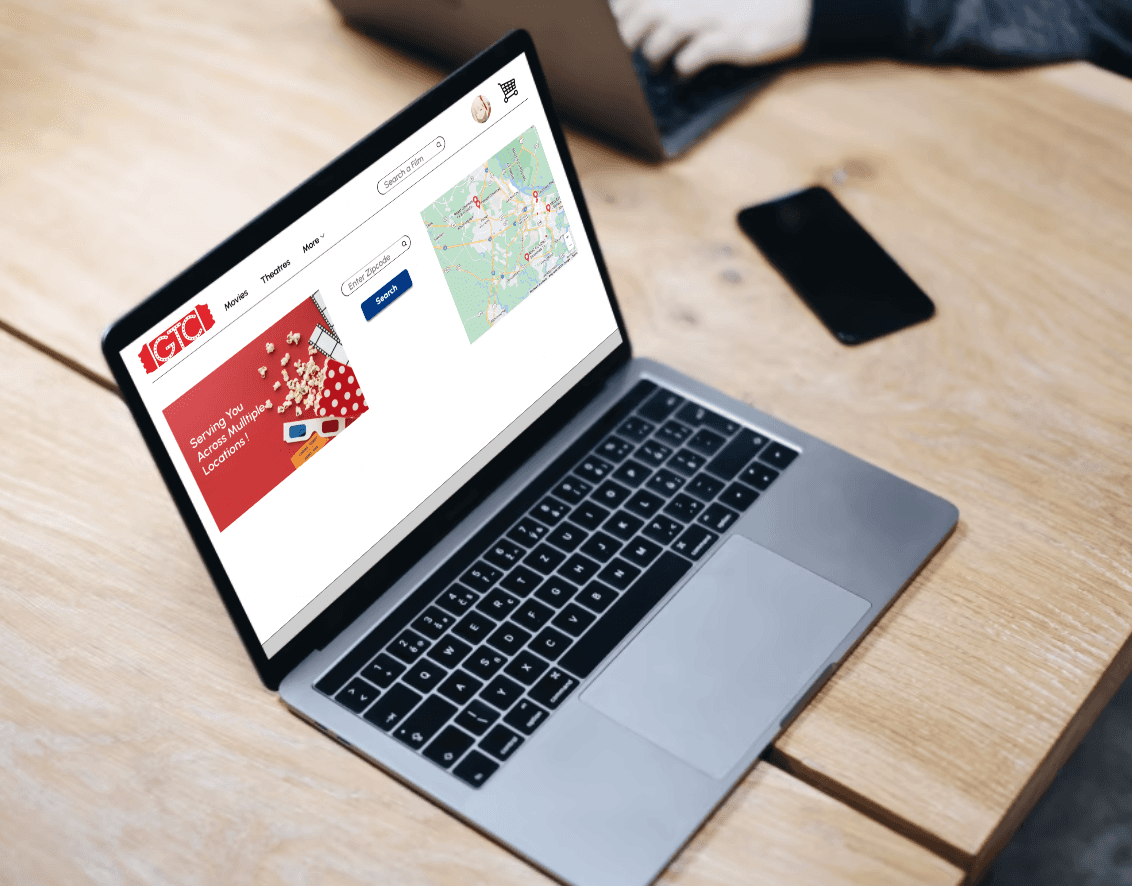
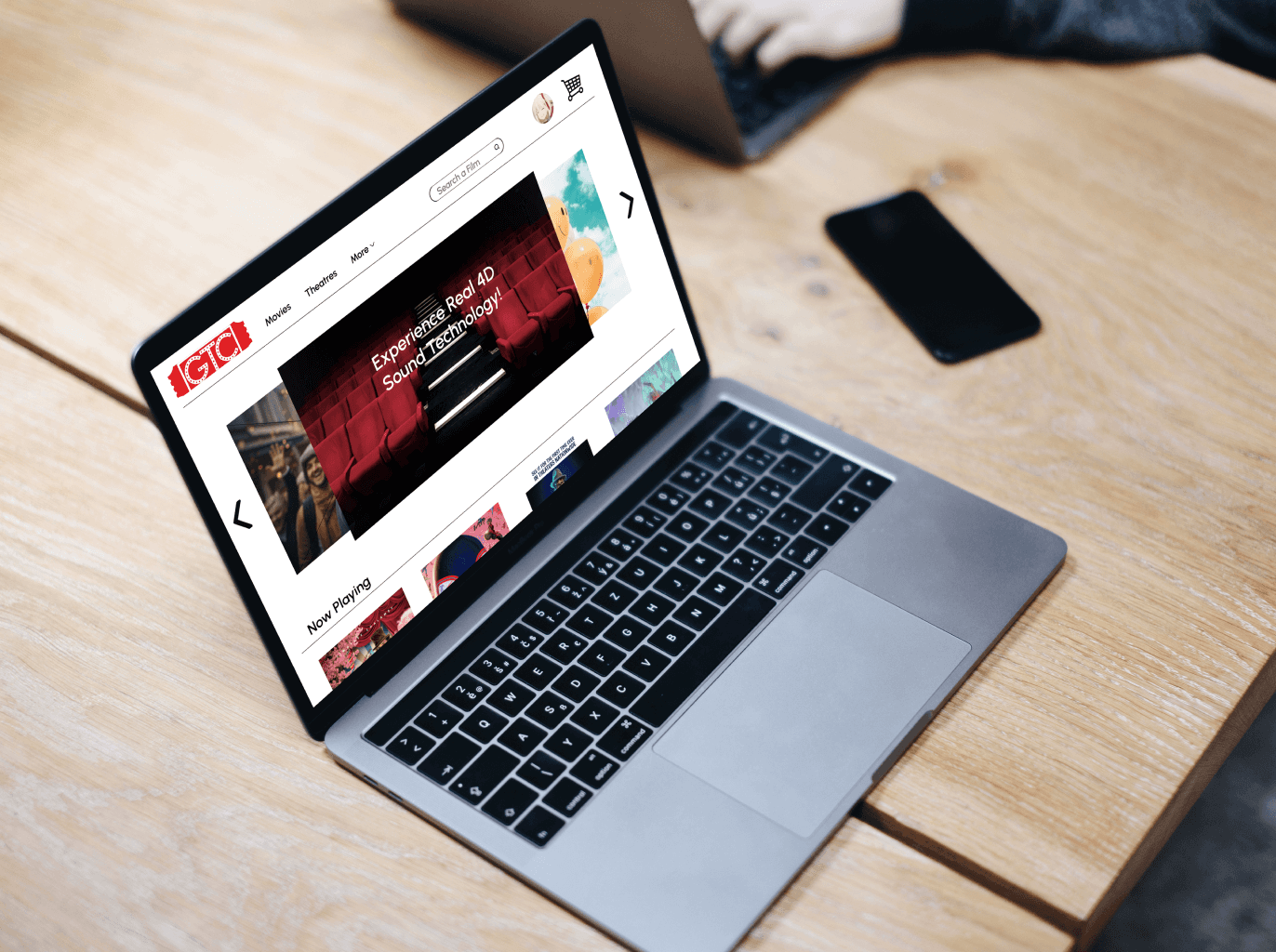
GTC Theatre App is a company that at the time had no website and I wanted to change that since it is a great place. I decided to use a goal directed design method which revolves around focusing on our persona creation, competitive audits, and goals.

Challenges

1) Navigation - Create a simple and intuitive user journey


2) Interaction - Foster a simple and direct selection process without any mess


3) Straight Forward - User Flow streamlined without any distractions


4) Experience - Creating a natural flow that was seamless and fun to interact with

Kickoff

For this project I wanted to reinforce the basics, and to build a strong cohesive site for a theatre company in the area I personally loved. I noticed it did not have a website and wanted to give it the best aspects of other theaters could offer to help drive customer engagement. I started with the competitive audit to help gauge the most sought after features since this industry has been around so long, and then proceeded to conduct interviews, perform usability studies, and iterating off feedback.

For this project I wanted to reinforce the basics, and to build a strong cohesive site for a theatre company in the area I personally loved. I noticed it did not have a website and wanted to give it the best aspects of other theaters could offer to help drive customer engagement. I started with the competitive audit to help gauge the most sought after features since this industry has been around so long, and then proceeded to conduct interviews, perform usability studies, and iterating off feedback.

Why

Creating a movie buying experience for a theatre for online users

Users

Who would be the primary and tertiary user for an app like this and what is the focus?

Structure

Organizational layout would have to be carefully considered.

User Flow

How would the user get from the start point to the end?

Navigation

How to make sure that no road blocks would be involved?

Experience

How could a design be implemented to create a experience that sets it apart from the competition?

Data from the competitive audit during the research phase proved to be the most helpful in terms of iteration of the app. It was also found that moderated and unmoderated usability studies were the most effective path forward, for this type of project. This involved initial planning, interviewing users, empathy mapping, personas, defining problem statements and goals, and a competitive analysis. Starting out a few key questions were asked.

Data from the competitive audit during the research phase proved to be the most helpful in terms of iteration of the app. It was also found that moderated and unmoderated usability studies were the most effective path forward, for this type of project. This involved initial planning, interviewing users, empathy mapping, personas, defining problem statements and goals, and a competitive analysis. Starting out a few key questions were asked.

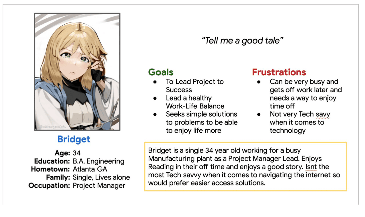
Persona User Bridget

Competitive Analysis

The competitive market available for this type of service online was very oversaturated with lots of different company and services to choose from. This aided in helping to ascertain which aspects and elements worked best for a theatre website and led the path in what to look for first and foremost when designing the site. Certain elements such as layout of information, user flow, and the use of negative space to help draw attention to the content in a subtle balancing act.

From all the websites observed it seemed AMC had the most desirable elements to draw inspiration from however there were some things that in needed. Some notable imporvements were.

- Home Screen being easily eclipsed by pop up content and menus not intended to be selected.

- User Flow could be streamlined better

Preparing the Journey


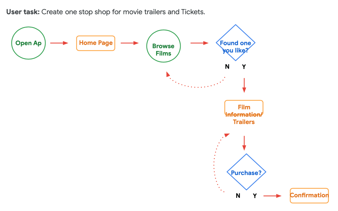
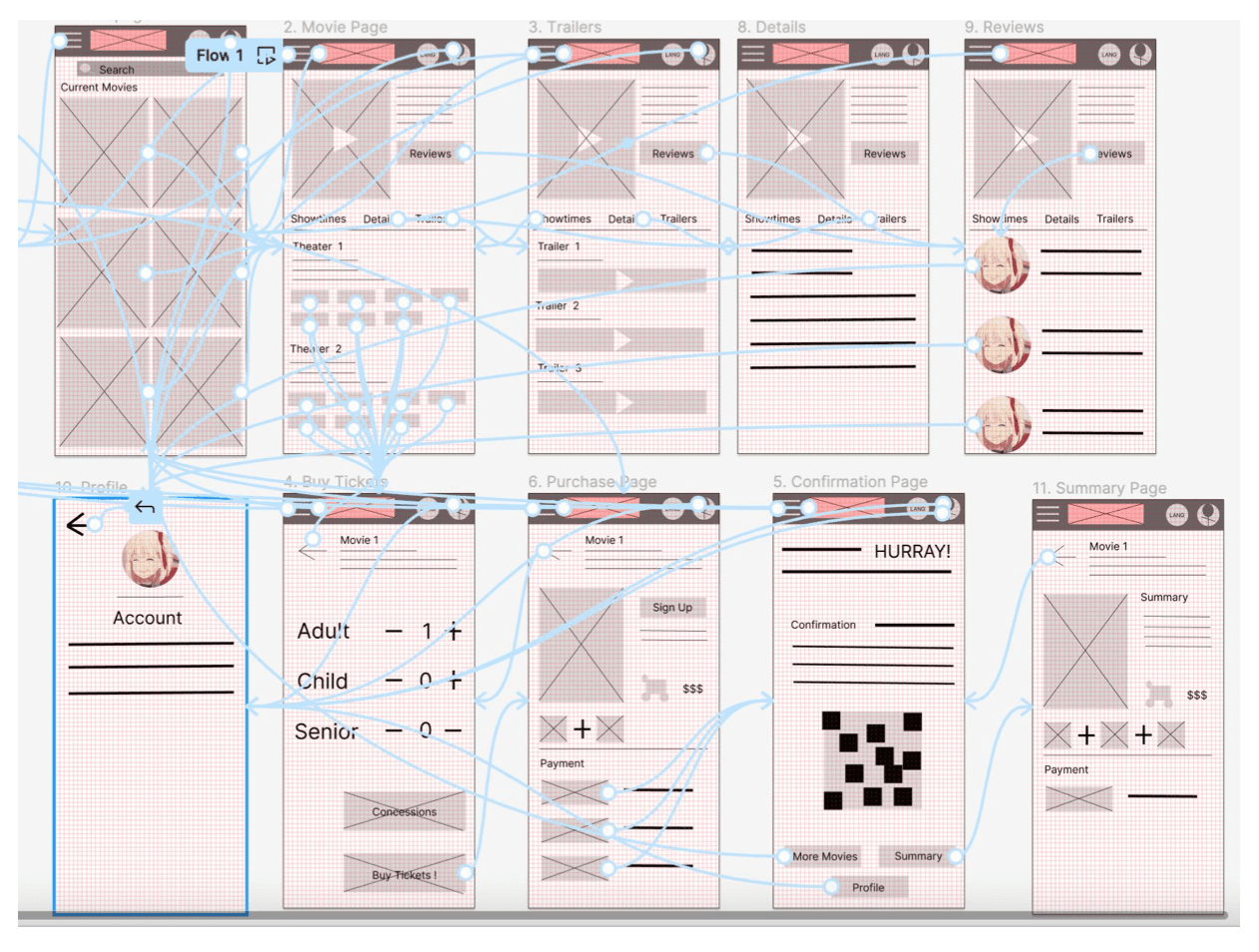
A user flow was constructed based on what a typical start to finish journey would look like while picking a film, where seeing reviews and out side resources like movie trailers in a non obtrusive way while keeping in order. This helps in understanding the ways users interact with the product as well as providing an oversight of the flow of content.


A user flow was constructed based on what a typical start to finish journey would look like while picking a film, where seeing reviews and out side resources like movie trailers in a non obtrusive way while keeping in order. This helps in understanding the ways users interact with the product as well as providing an oversight of the flow of content.

Wireflow


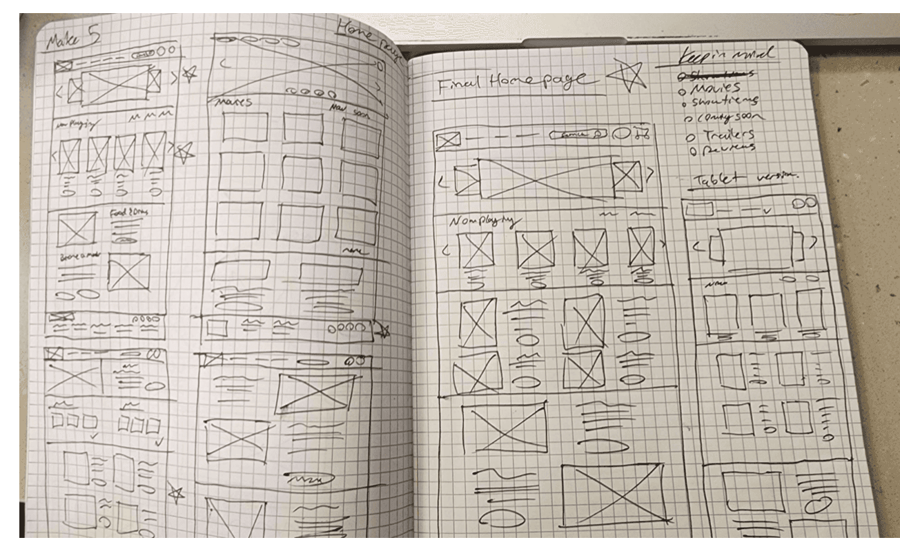
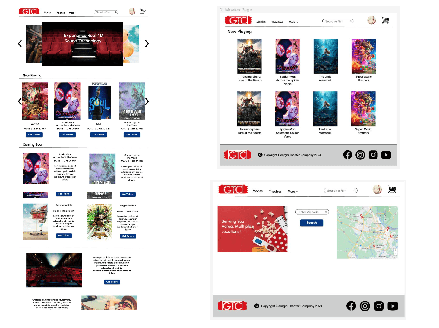
After sketching out the initial flow of the app and information architecture to be applied, a preliminary lo fi mockup was created to help visualize the layout and the user journey one would take to travel from screen to screen. A lot of time was spent on this step to make sure the underlying finishing touches in the UX were finalized and were easy to use for our target user before moving on to applying the visual elements.


After sketching out the initial flow of the app and information architecture to be applied, a preliminary lo fi mockup was created to help visualize the layout and the user journey one would take to travel from screen to screen. A lot of time was spent on this step to make sure the underlying finishing touches in the UX were finalized and were easy to use for our target user before moving on to applying the visual elements.

Iteration


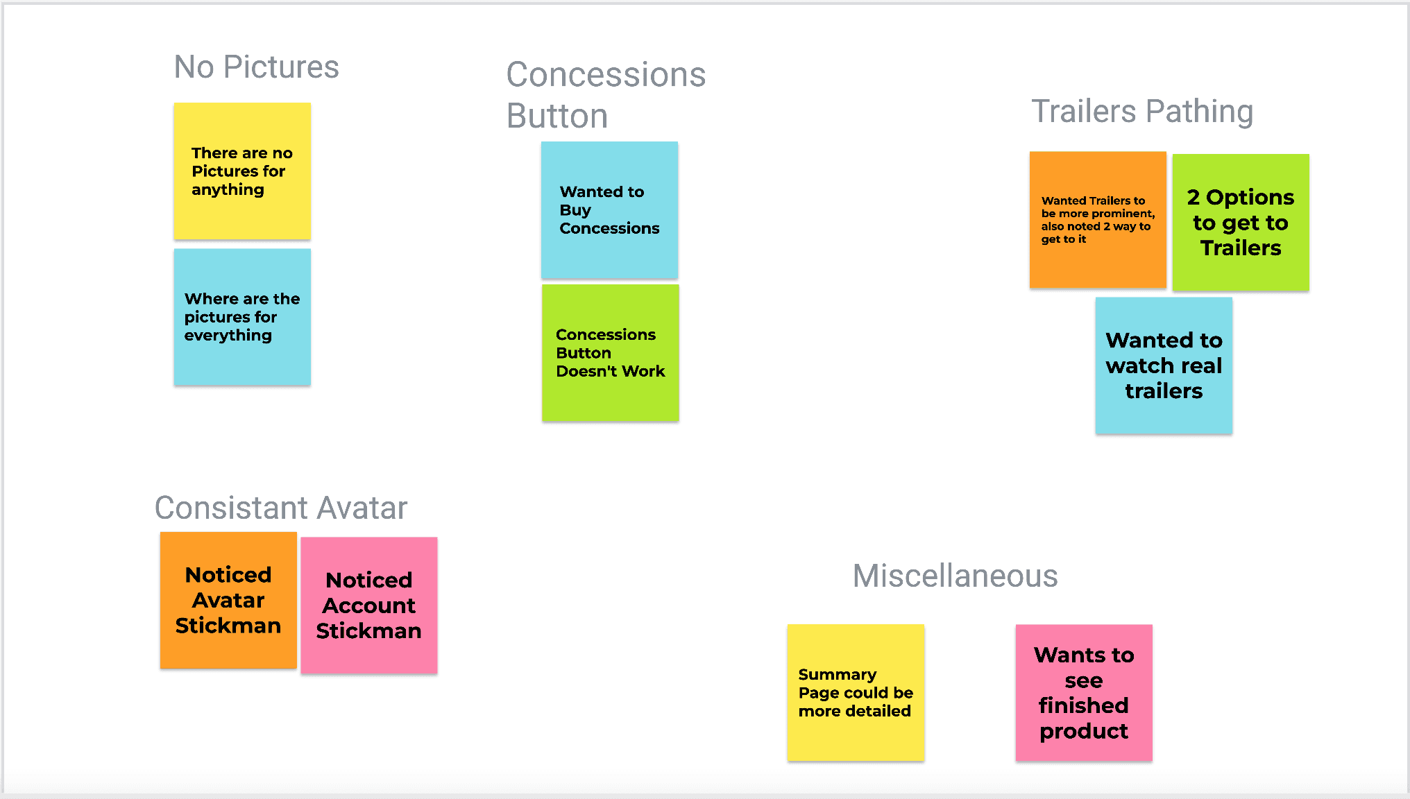
After creating the prototype utilizing low fidelity wireframes, a research survey and usability test were conducted. 5 different users were tested and asked to complete the process of selecting a movie. The types of users included target audience participants, younger user, and busy individuals. By asking an eclectic group of users to complete this task it was the intention to help reveal any pain points that could be iterated on.


After creating the prototype utilizing low fidelity wireframes, a research survey and usability test were conducted. 5 different users were tested and asked to complete the process of selecting a movie. The types of users included target audience participants, younger user, and busy individuals. By asking an eclectic group of users to complete this task it was the intention to help reveal any pain points that could be iterated on.

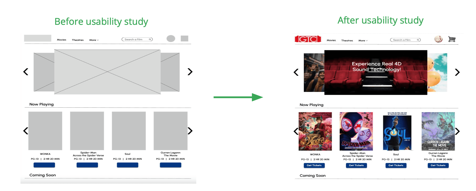
Homepage Redesign

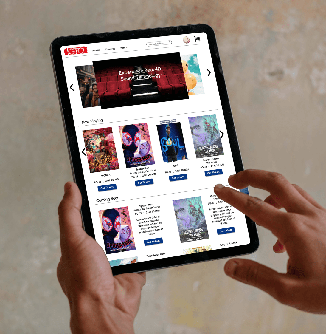
It was brought to my attention that the homepage was in dire need of redesign into something more easy to digest at first glance, ensuring users of all technical levels could readily access the site.

Information Arch.

It was discovered that the Information Architecture of the trailers could use some fine tuning in order to avoid creating duplicates. Avoiding causing any confusion in the user journey having to tread the same ground can be distracting.

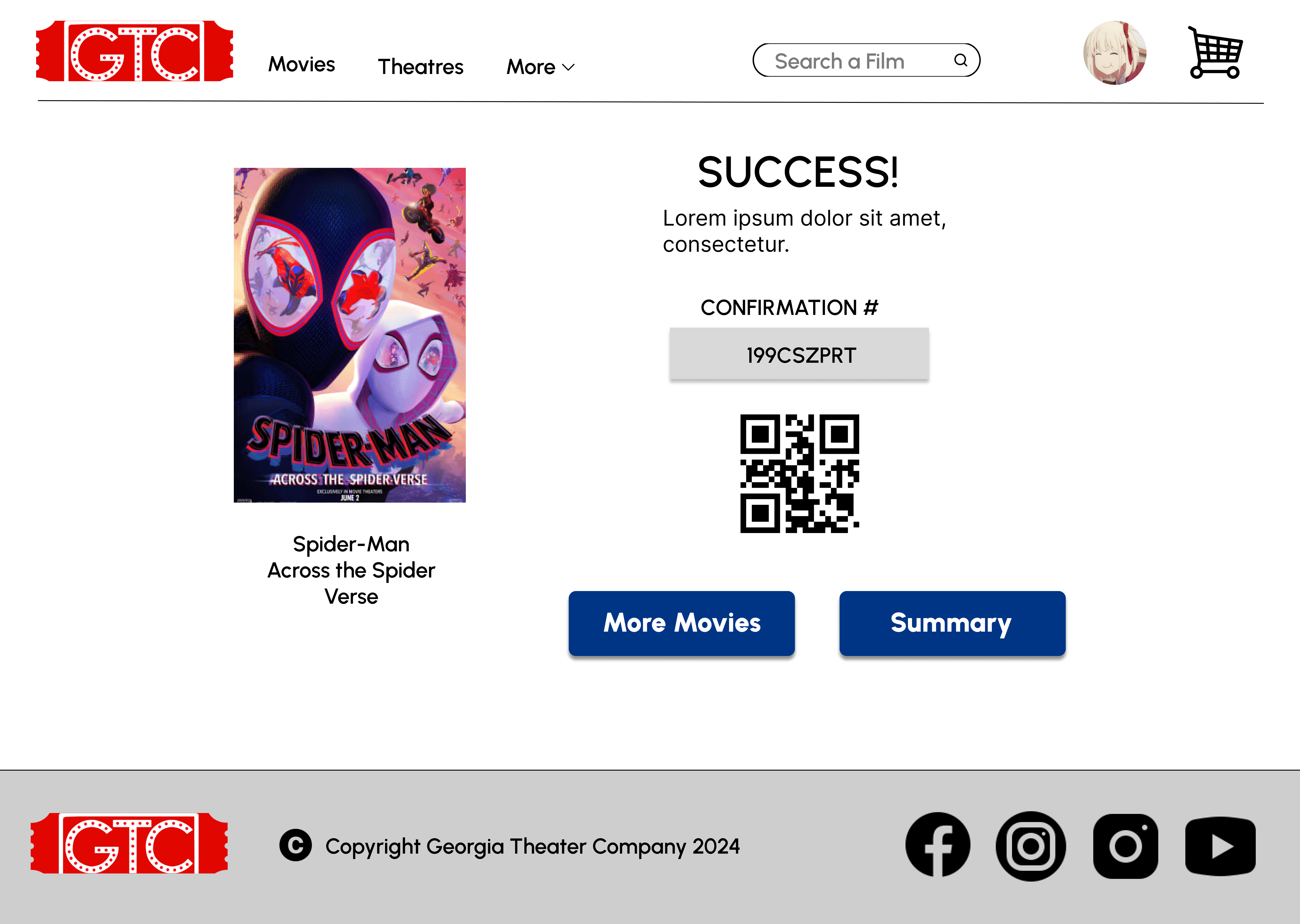
Mock Up

A lot of the users interviewed seemed to have trouble grasping the concept of it all and almost all participants had issues with the lack of visual presentation as everything was still in the lo fi phase.
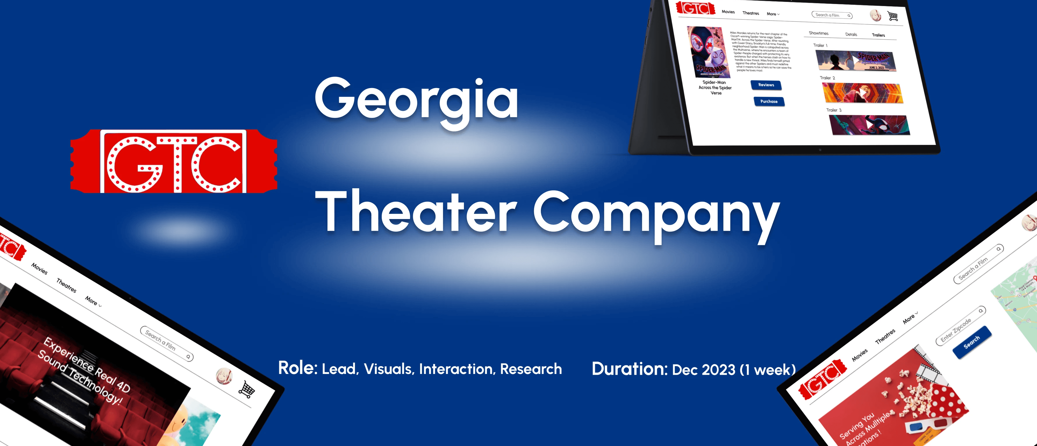
Challenge #1

Navigation

Ensuring that the navigation was intuitive and easy to follow was one of the most important aspects of the site to emphasize. Deciding on what categories and where to put them were informed heavily from the competitive audit.

Challenge #2

Interaction

Making the user flow a continuous journey without any distractions until the process was completed incorporating a seamless experience was enhanced by streamlining the click path.

Challenge #3

Straightfoward

Making sure the important information was put forth first and foremost, deciding on which elements to focus on were informed by the usability studies and interviews.

Challenge #4

Experience

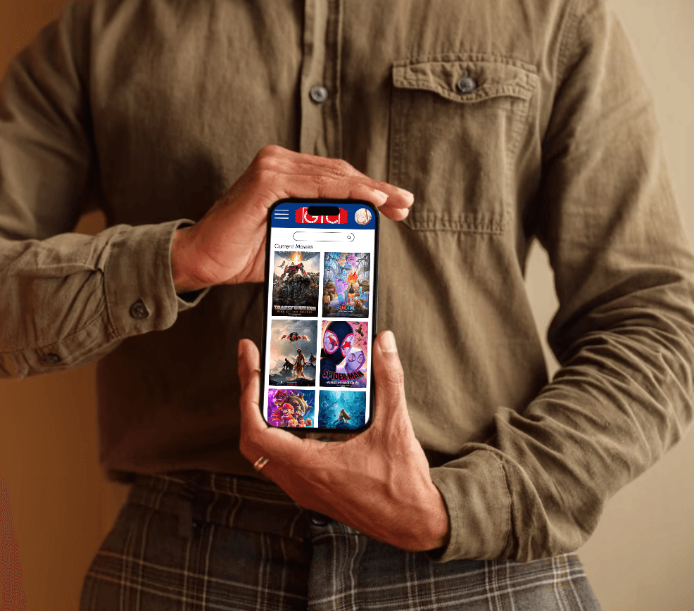
Ensuring the design was appealing and professional in all aspects was paramount as well to make the user feel secure in the app. The aim was to foster a great experience that would leave the user prefer coming back to this app as opposed to competition.

Style Guide


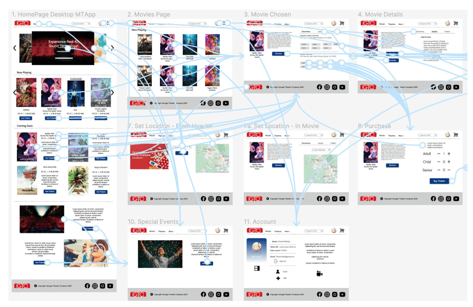
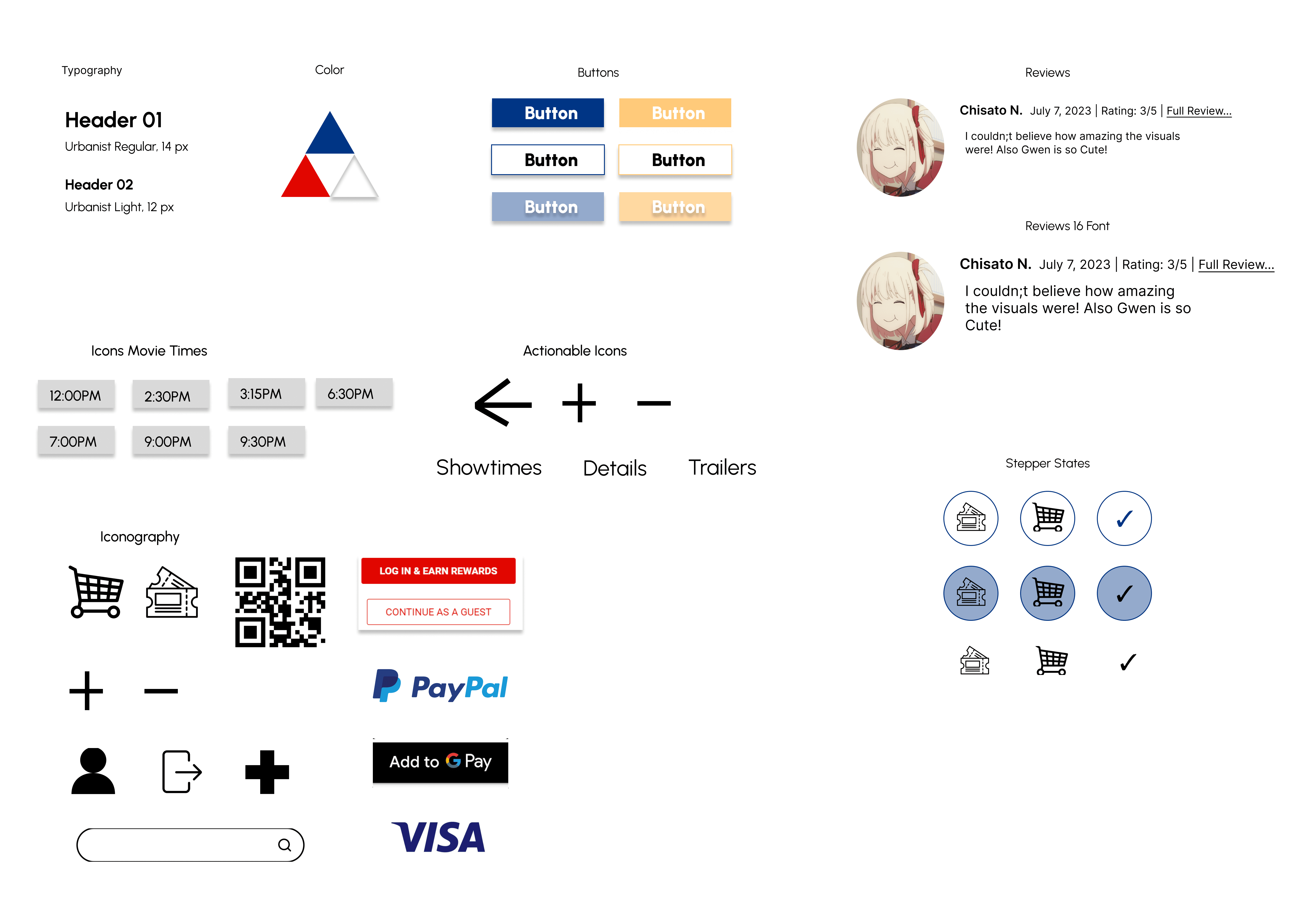
After sketching out the initial flow of the app and information architecture to be applied, a preliminary lo fi mockup was created to help visualize the layout and the user journey one would take to travel from screen to screen. A lot of time was spent on this step as a lot of the complaints stemming from the usability study was the lack of visual elements to understand what the big picture was, thus distracting from the overall aim of the study. Since the theatre also already had a color scheme it utilized, I made sure to work within those confines.


After sketching out the initial flow of the app and information architecture to be applied, a preliminary lo fi mockup was created to help visualize the layout and the user journey one would take to travel from screen to screen. A lot of time was spent on this step as a lot of the complaints stemming from the usability study was the lack of visual elements to understand what the big picture was, thus distracting from the overall aim of the study. Since the theatre also already had a color scheme it utilized, I made sure to work within those confines.

Key Takeaways


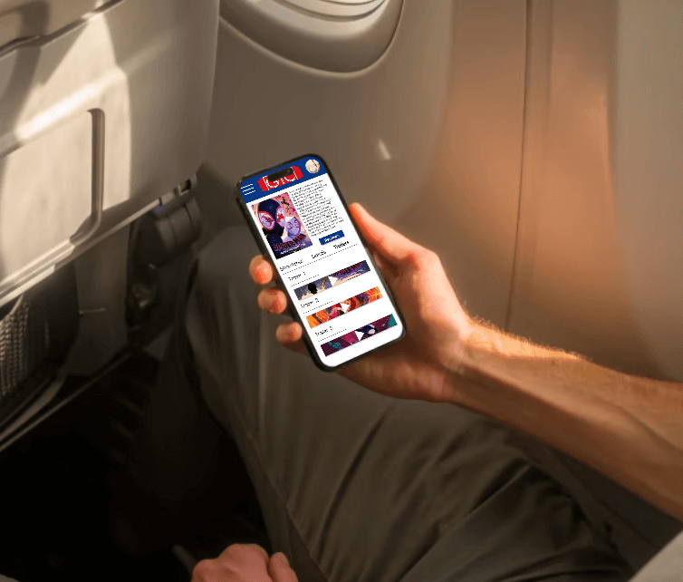
For my favorite theatre I frequented, I wanted to ensure there was ample reason to use this site over the competition. This means having to offer something that the other sites tend to overlook. Initially the aim was to make access to the trailers from the movie information page as easy as possible, however this soon grew expand to all aspects of the site as more actions flowed to one another, I saw the big picture to apply this mentality site wide and thus creating a cohesive user journey that flowed naturally. This help demonstrate the power of design and how if something is working great, one would never even notice it.

Thank you for your time, and be sure to check out the process for GTC Theatre below!

Process Deck

© Jeffrey Pugh 2024