Project Vision
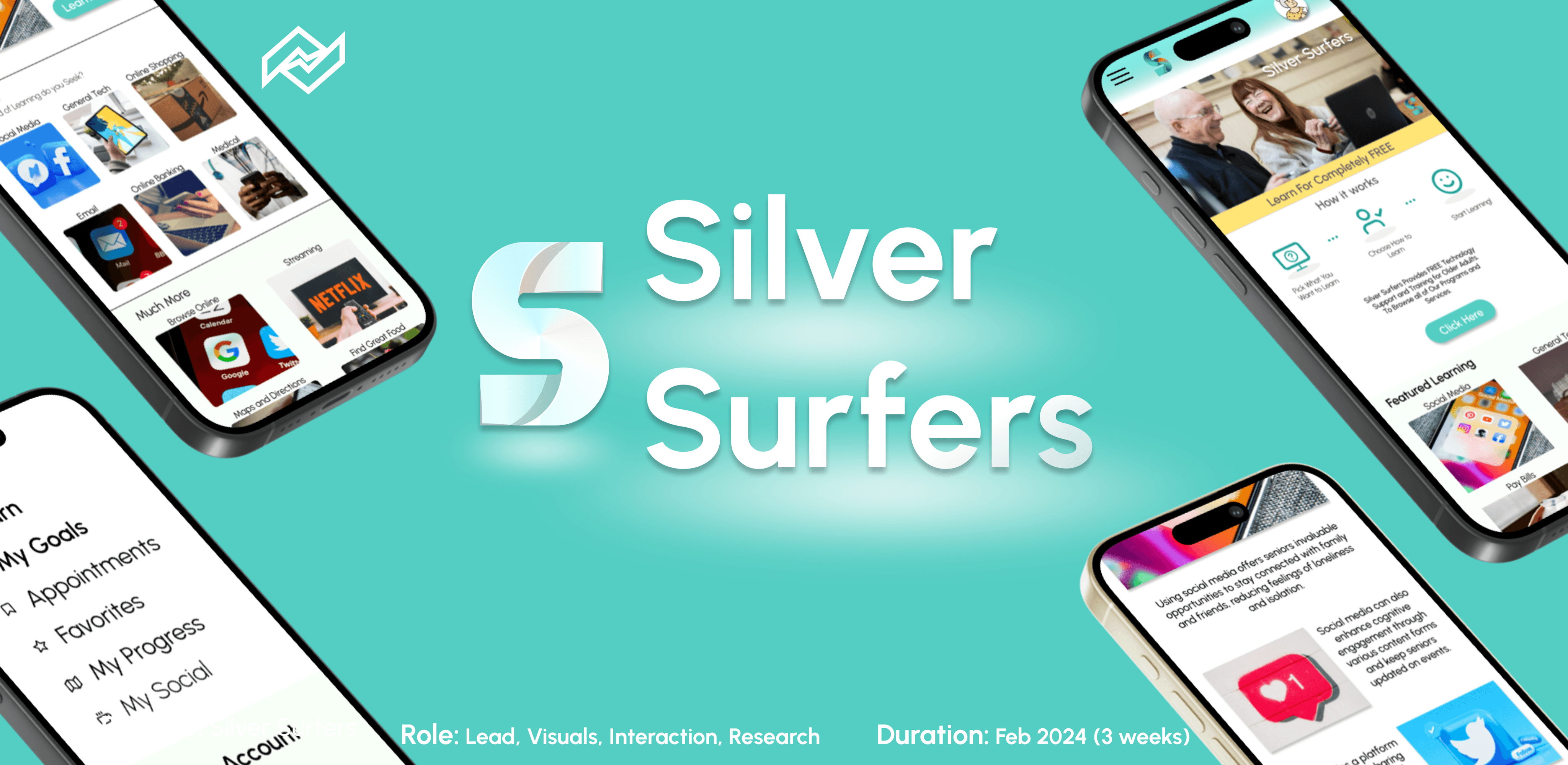
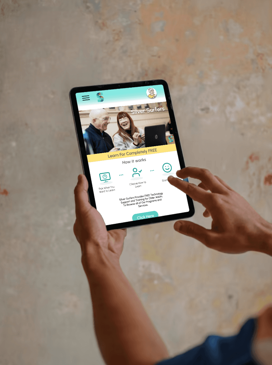
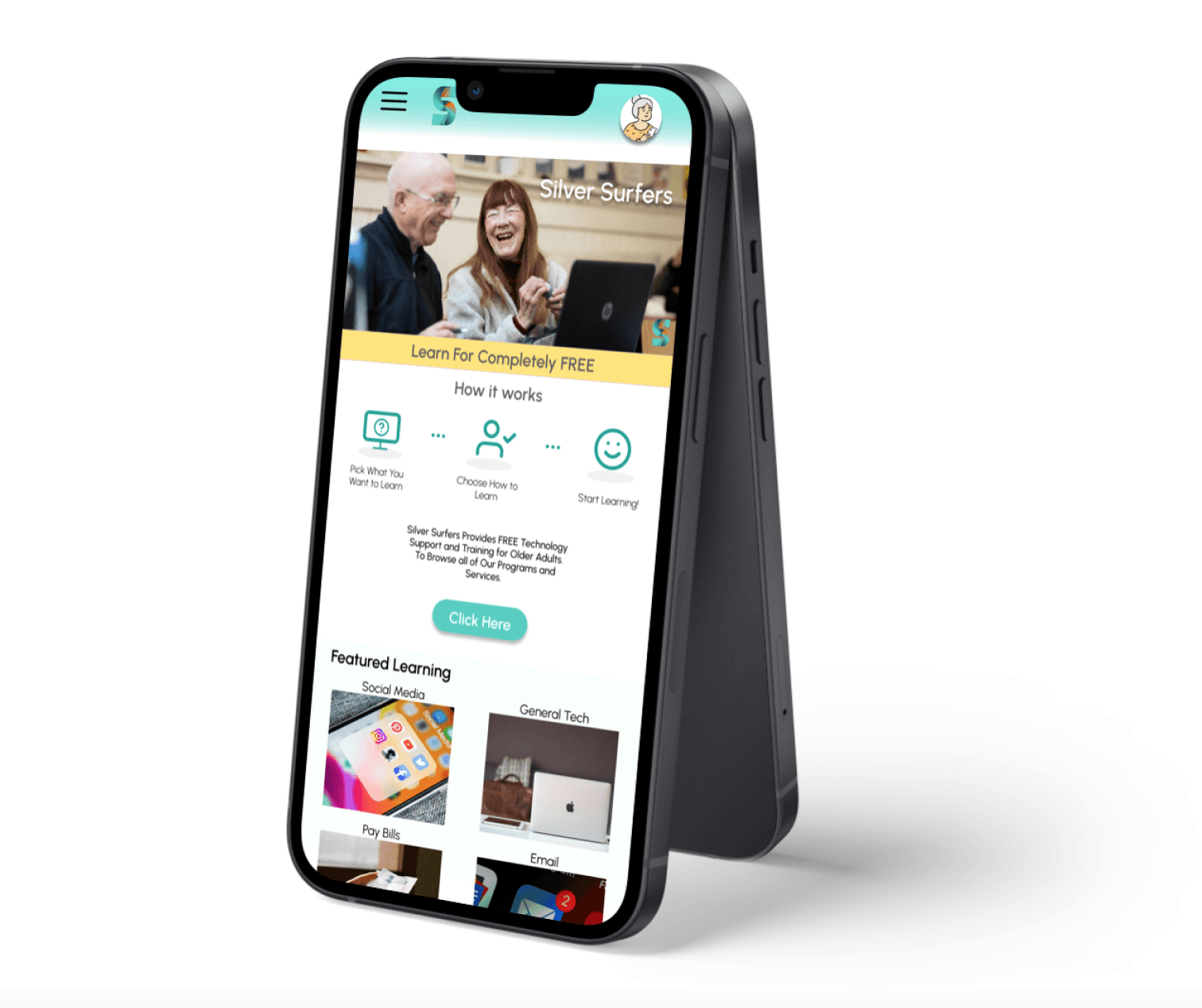
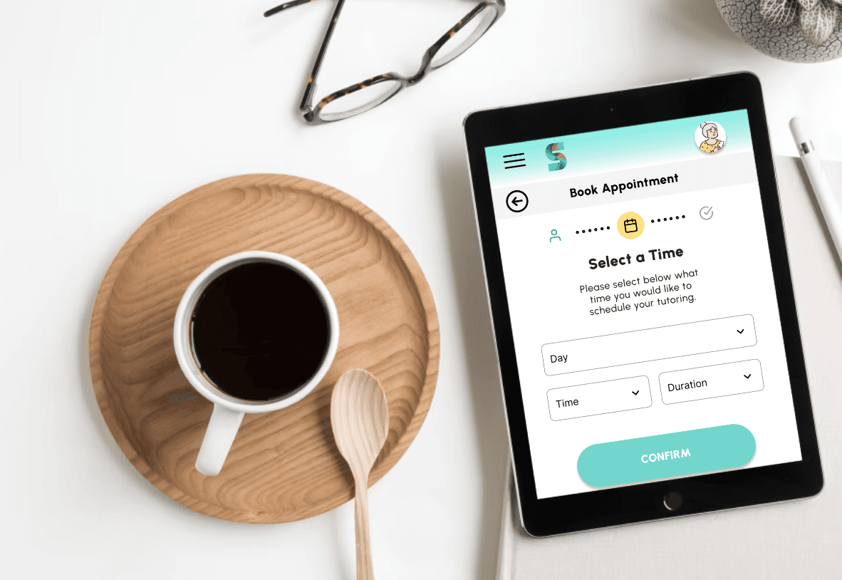
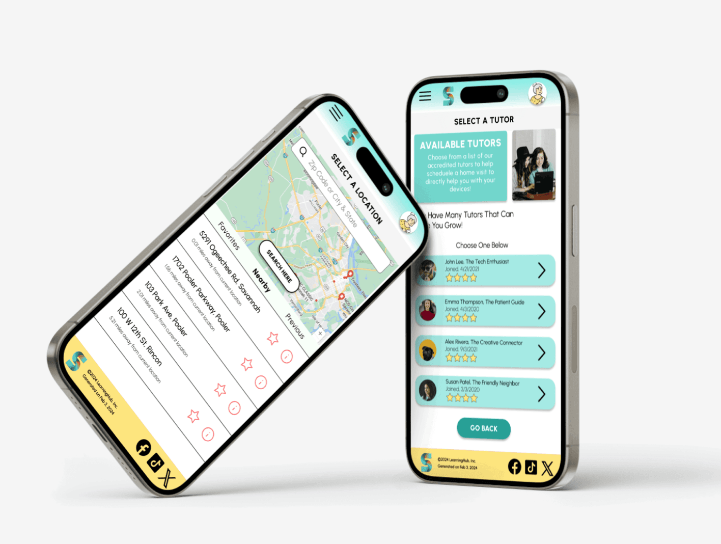
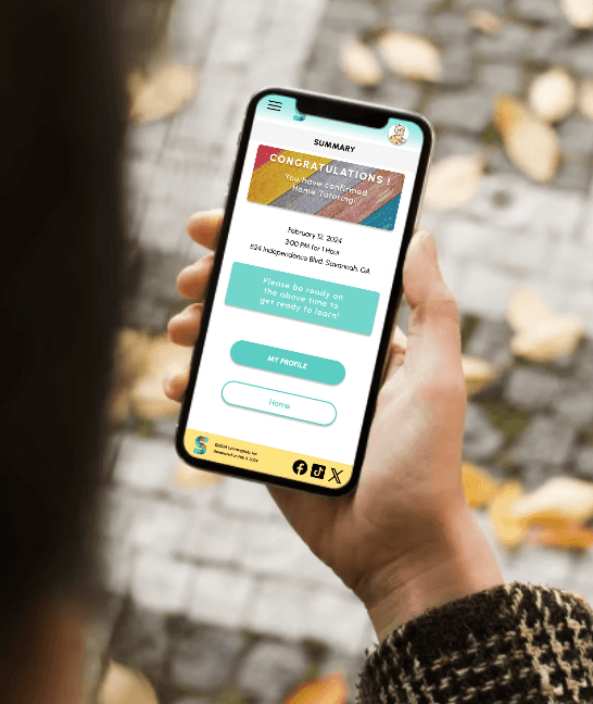
Cyber Seniors is a teaching resource app targeted towards older and less technically adept users and gives them the resources to learn, research, and schedule tutoring. For this project, I decided to use a goal directed design method which revolves around focusing on our persona creation and goals.
Challenges
1) Lack of Resources - Currently available resources are far and few in between
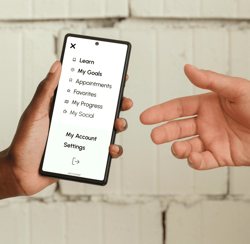
2) Navigation - Creating a simple and effective click path for any experience level
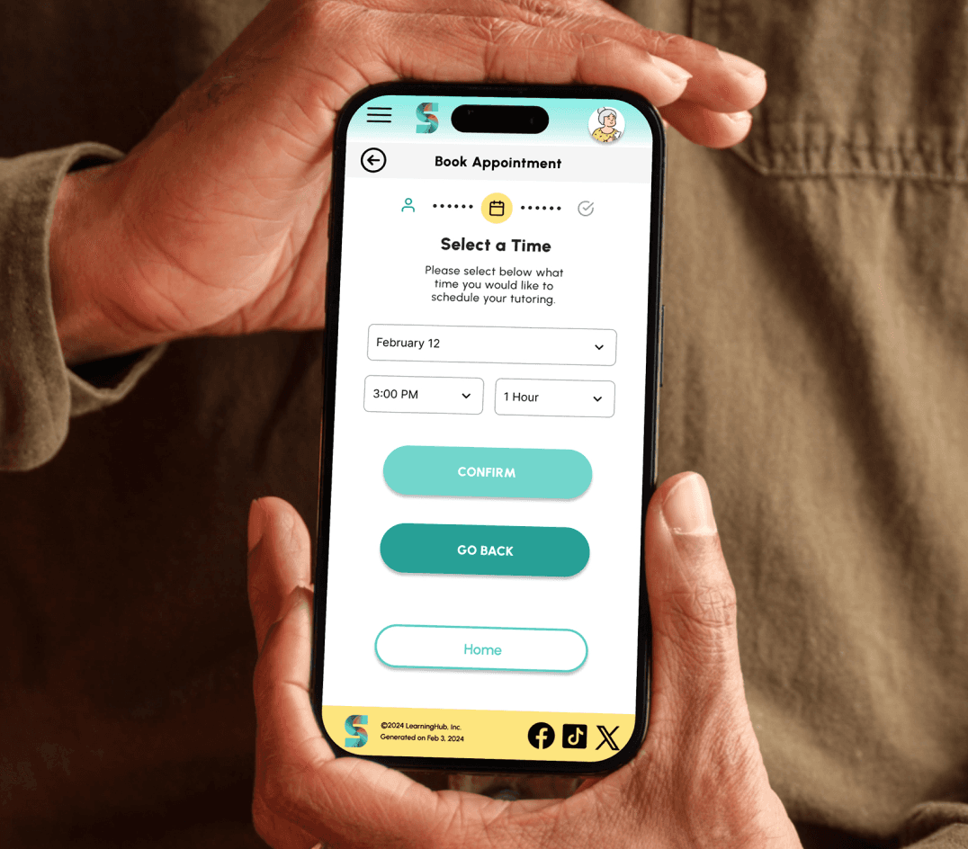
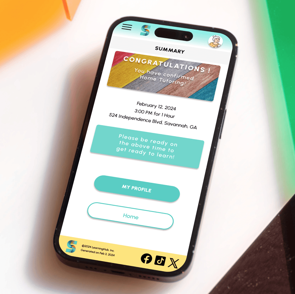
3) User Flow - Creating a seamless user experience and natural flow.
4) Experience - Ensuring all aspects of the design were professionally considered.
Kickoff
In this project I took a goal oriented design approach which proved to be the most effective path forward for this type of project. This involved initial planning, interviewing users, empathy mapping, personas, defining problem statements and goals, competitive analysis. Starting out a few key questions were asked.
Why
How many loved ones wish they could be more involved with their families lives?
Users
Who would be the primary and tertiary user for an app like this and what is the focus?
Services
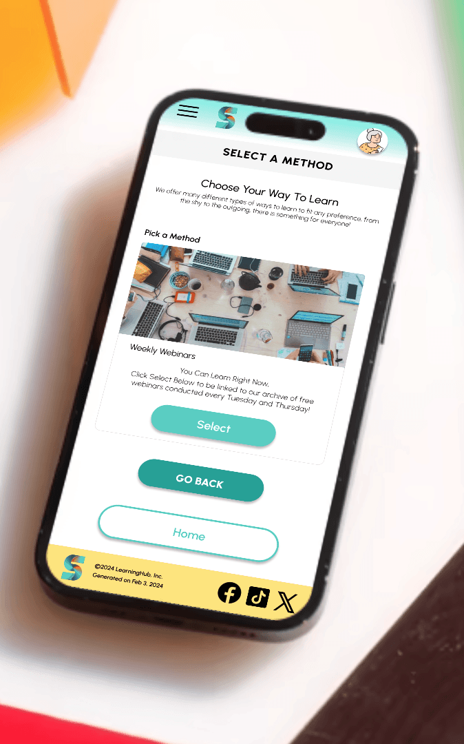
How would the right learning fit the right person? While some may be more introverted.
User Flow
How would the user get from the start point to the end?
Navigation
How to make sure that no road blocks would be involved?
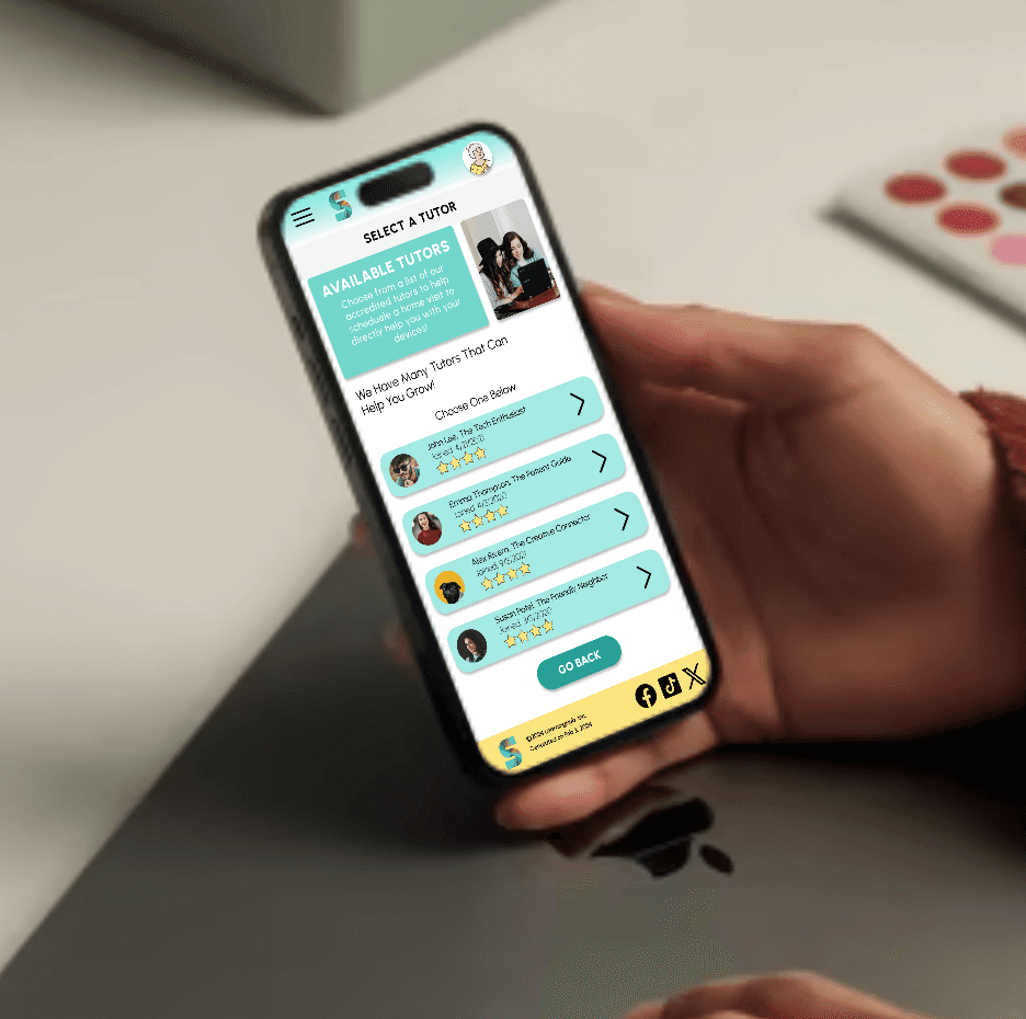
Tutoring
How could implementing a way to have direct help be created?
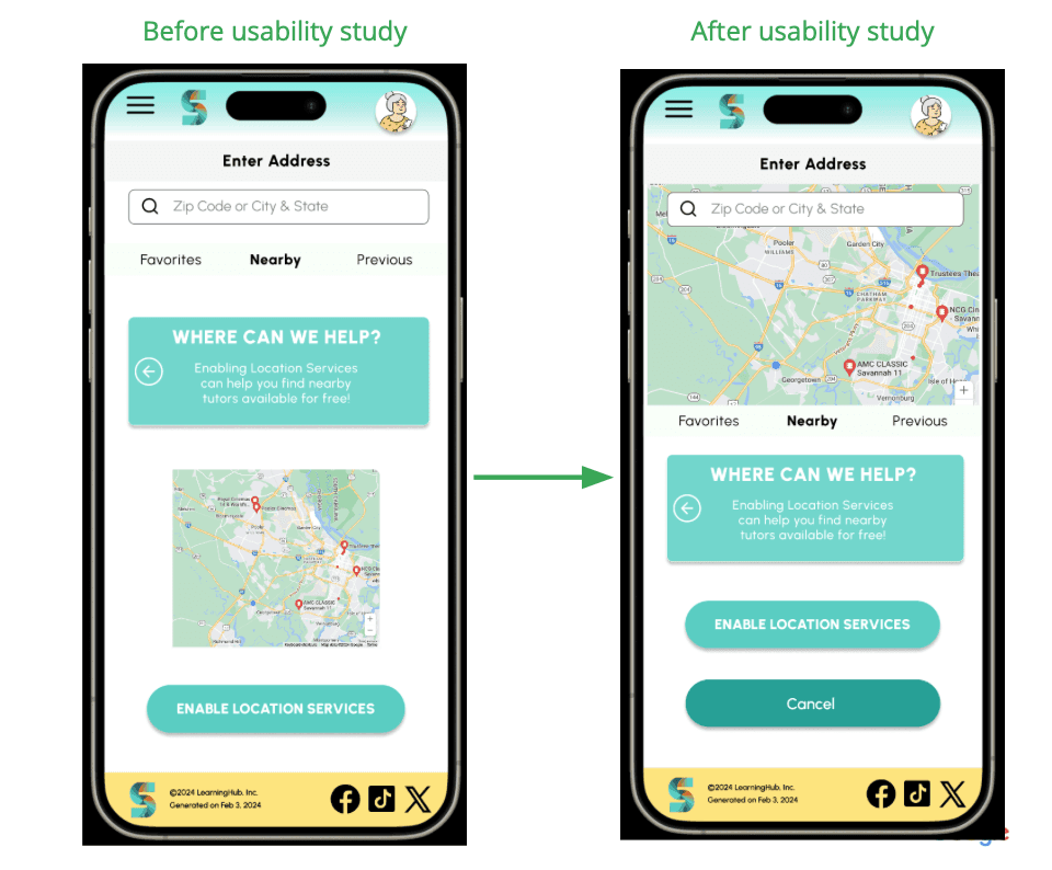
Data from the research phase proved to be the most helpful in terms of iteration of the app. It was also found that moderated and unmoderated usability studies were the most effective path forward, for this type of project. This involved initial planning, interviewing users, empathy mapping, personas, defining problem statements and goals, and a competitive analysis. Starting out a few key questions were asked.
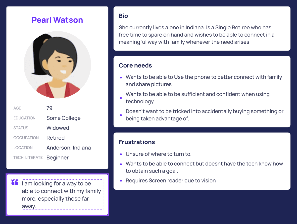
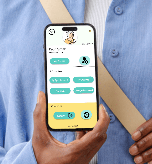
Persona User Pearl
Competitive Analysis
The competitive market available for this type of service online was severely overlooked as there wasn't any much direct competition to what we were designing for. This lead me to believe that it is an untapped market and Silver Surfers has the opportunity to capitalize on this by providing services and resources that no current product can offer.
A single website was found as a direct competitor and a source for inspiration for improvement was Cyber Seniors. Some notable imporvements were.
- Dull home screen with hero page
- User flow upon landing on the page needed more guidance
- Was unclear at what type of services were being offered
- Would be prone to crashing when trying to use main flow
Preparing the Journey
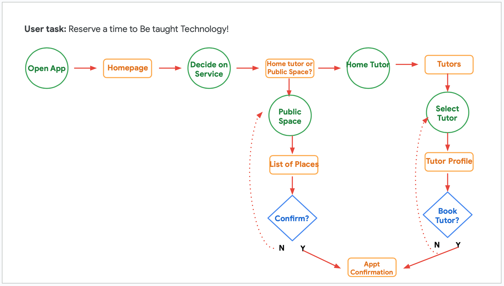
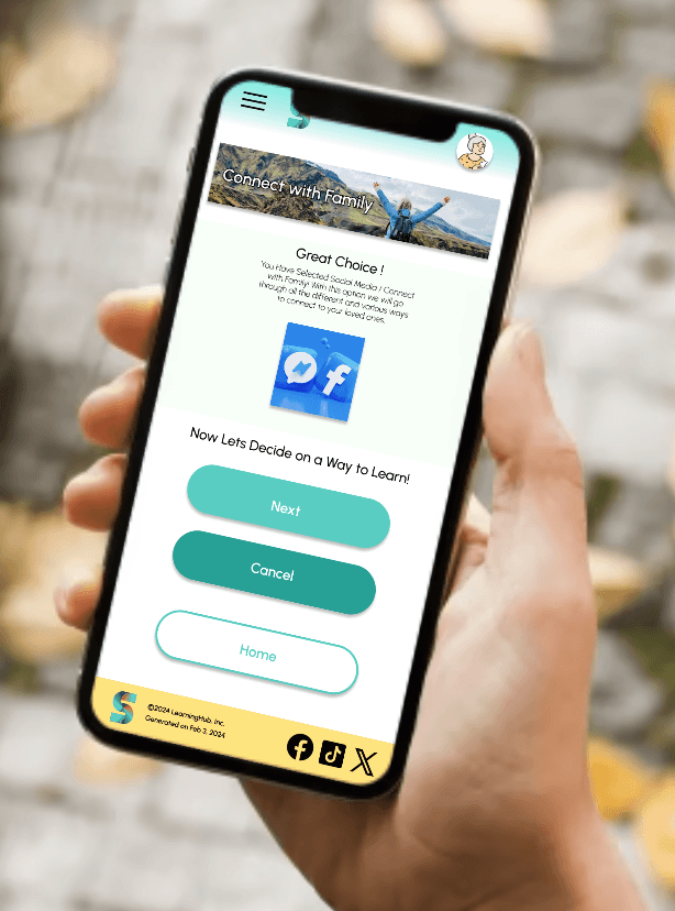
A user flow was constructed based on what a typical start to finish journey would look like while picking a learning method from something simple such as webinars or to something more advanced such as scheduling a tutoring session. This helps in understanding the ways users interact with the product as well as providing an oversight of the flow of content.
Wireflow
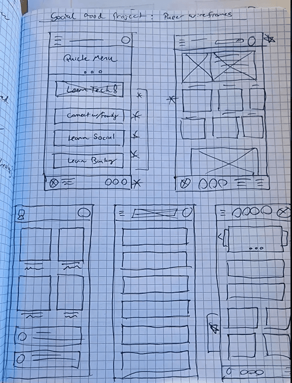
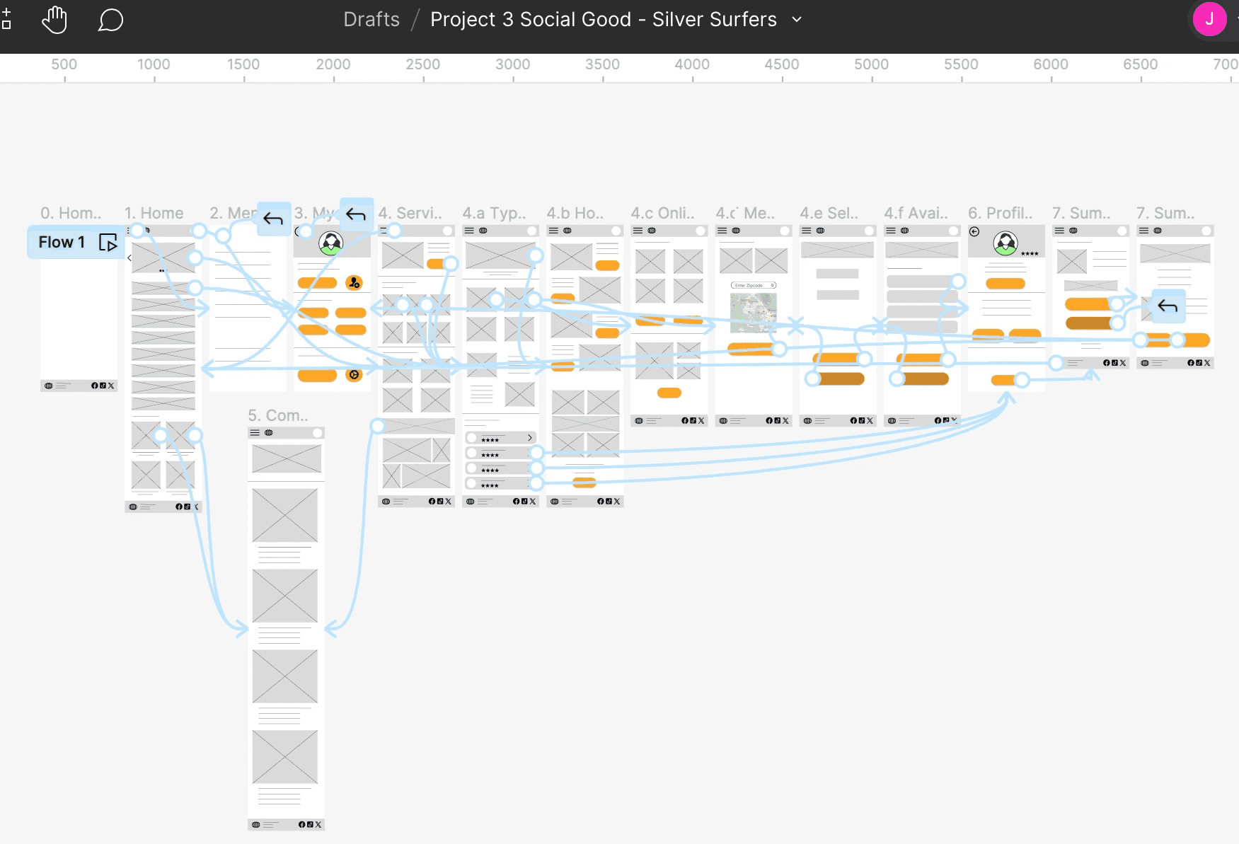
After sketching out the initial flow of the app and information architecture to be applied, a preliminary lo fi mockup was created to help visualize the layout and the user journey one would take to travel from screen to screen. A lot of time was spent on this step to make sure the underlying finishing touches in the UX were finalized and were easy to use for our target user before moving on to applying the visual elements.
Iteration
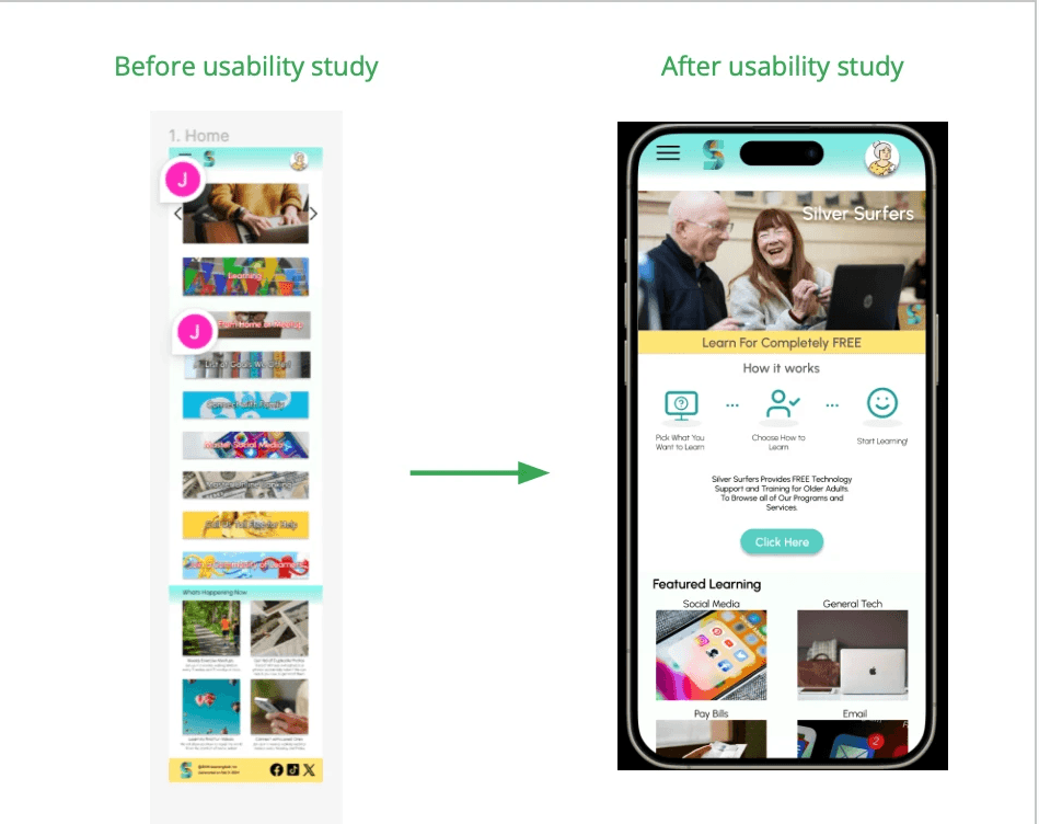
Homepage Redesign
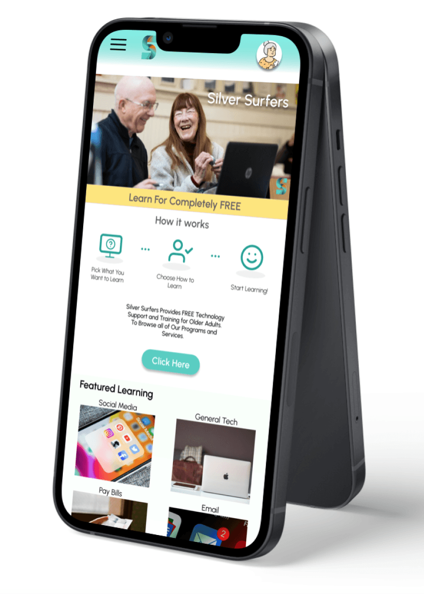
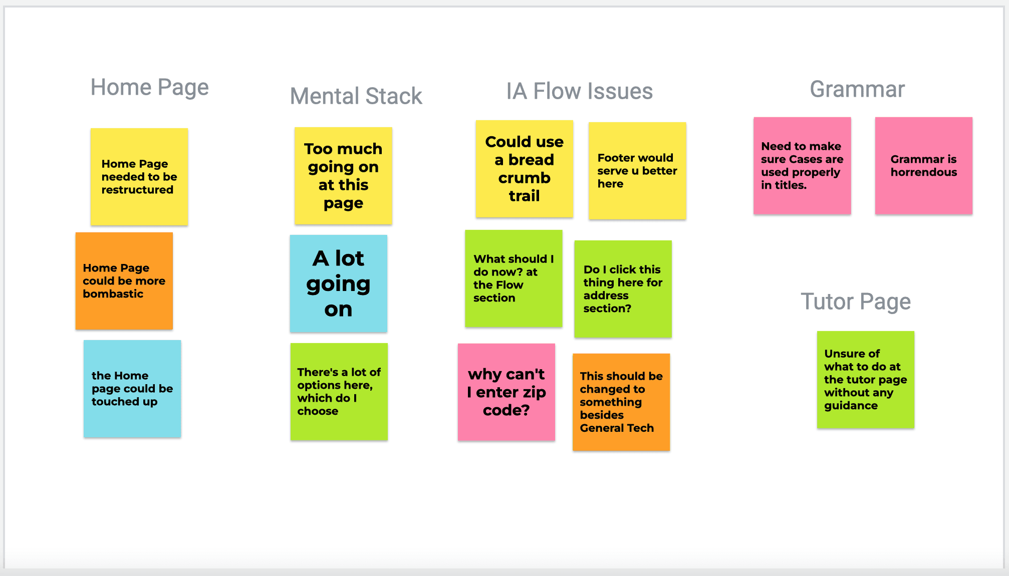
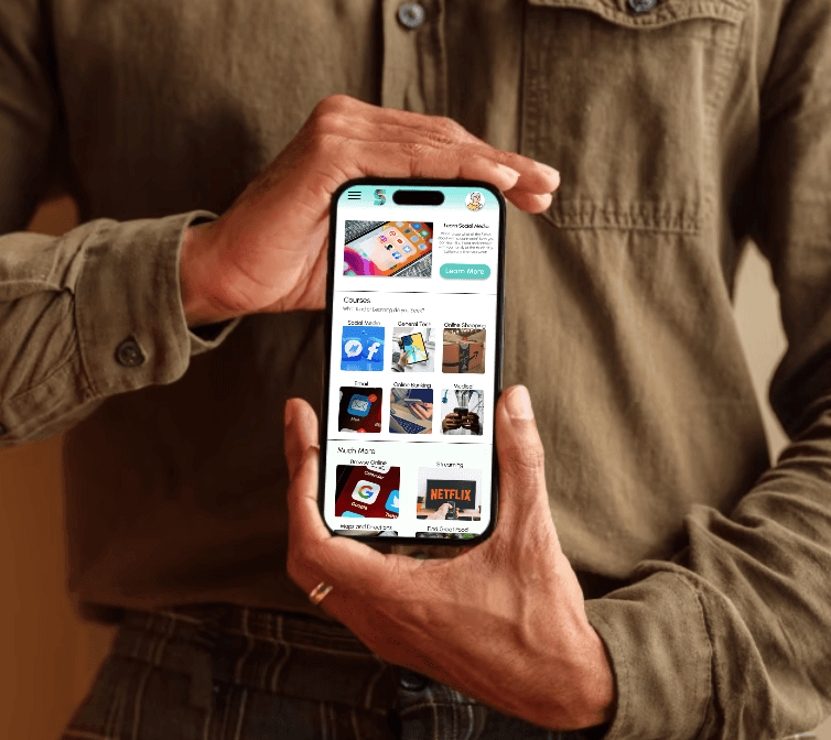
It was brought to my attention that the homepage was in dire need of redesign into something more easy to digest at first glance, ensuring users of all technical levels could readily access the site.
Information Arch.
It was discovered that the Information Architecture of the site could use some fine tuning in order to streamline the user journey flow, avoiding any crossroads that would leave the user guessing on what to do next.
Grammatical Errors
A few grammatical errors and structural oversights were identified here and there, such as inconsistencies in the titles. Considering the target user base, it was discovered that simple oversights like this could be interpreted as a dangerous site that would infect computers.
Challenge #1
Lack of Resources
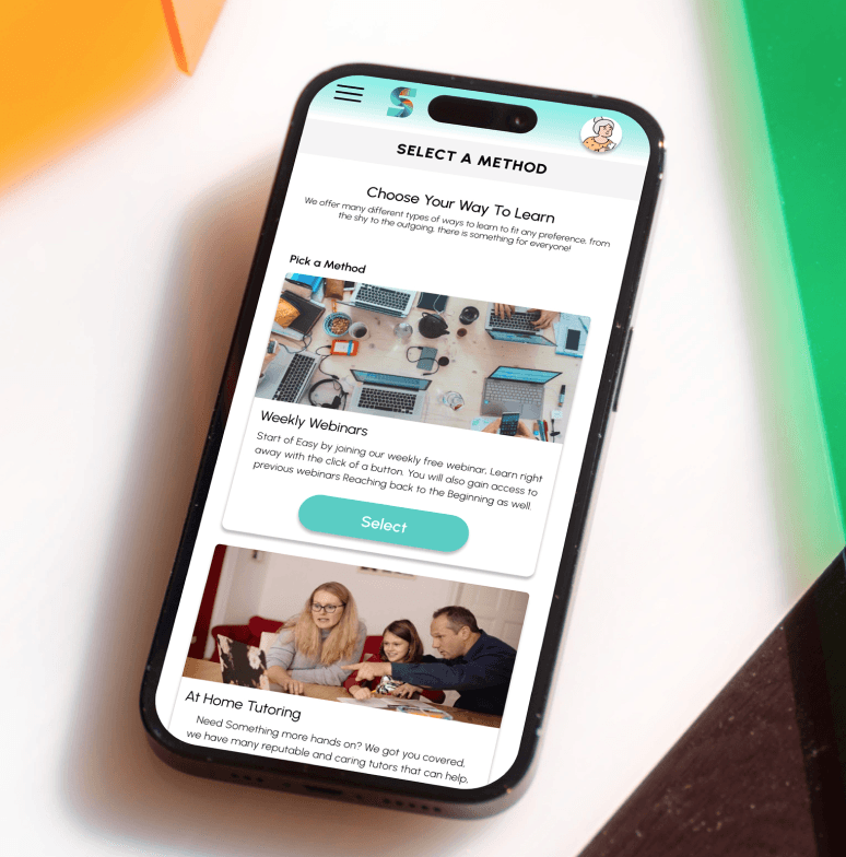
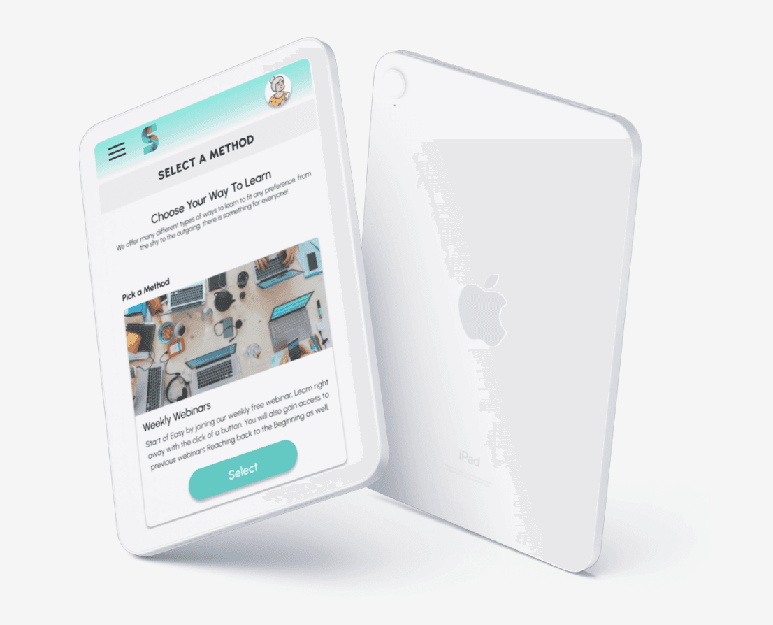
The initial lack of resources offered the freedom to be creative and realistically consider the users needs. In this case considering the median age range of the intended, it was imperative to offer a variety of methods to fit the varying personality ranges of a less adept user.
Trying to create a click path that was simple and easy to use at a glance was a challenge as one must take into account the experience level of the user. Therefore elements had to be laid out in a clear and concise method.
Challenge #3
User Flow
Creating a seamless experience that is easy was also a high area of concern when it came to user flow, as the tasks must lead into the other naturally to ensure user success.
Ensuring the design was appealing and professional in all aspects was paramount as well to make the user feel secure in the app. This included oversights such as grammatical errors and basic sentence composition.
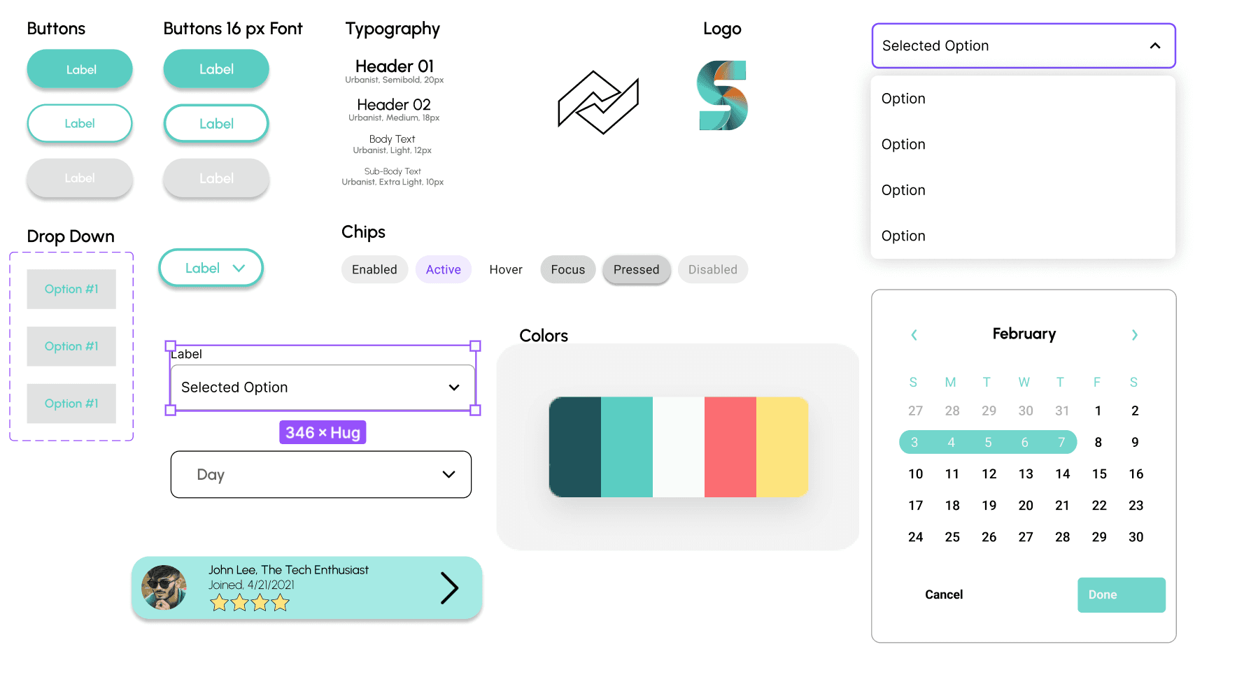
Style Guide
After sketching out the initial flow of the app and information architecture to be applied, a preliminary lo fi mockup was created to help visualize the layout and the user journey one would take to travel from screen to screen. A lot of time was spent on this step to make sure the underlying finishing touches in the UX were finalized and were easy to use for our target user before moving on to applying the visual elements.
Key Takeaways
We have all been there, a grandparent or any other family member, who would need help in using technology as it becomes more and more of everyday life. A lot of them want to learn and be involved with our families lives, while another subset of users are worried or afraid that they may make a mistake. It was from using this real world example that this app was brought to life. The idea of honing in on the persona hypothesis creation to help further the goals of the user while alleviating any concerns was key in discerning how the app was to take shape. I learned that putting the user first would bring to light a lot of issues one may have not considered before and only by interacting with users like this can it show what truly matters to them and what they consider the most important.
Thank you for your time, and be sure to check out the process for Silver Surfers below!
Process Deck
